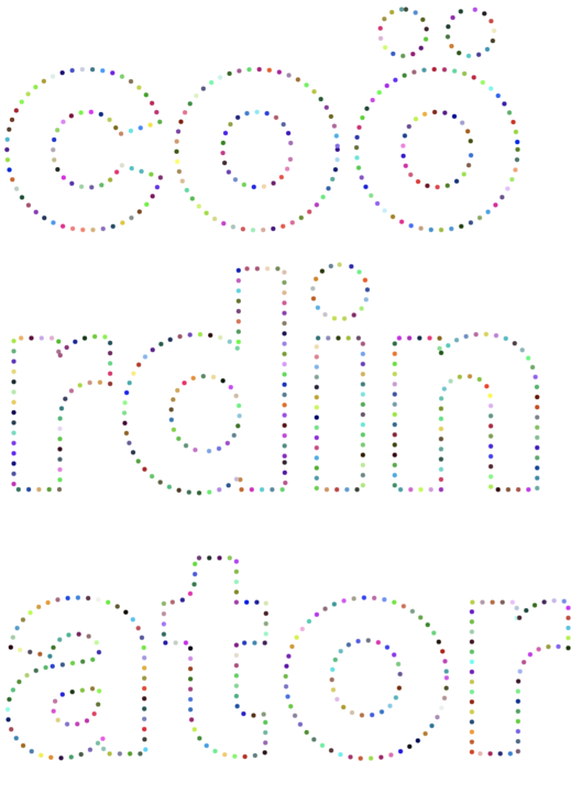
Introducing Coördinator: A new open source project made at Spotify to inject some whimsy into data visualizations
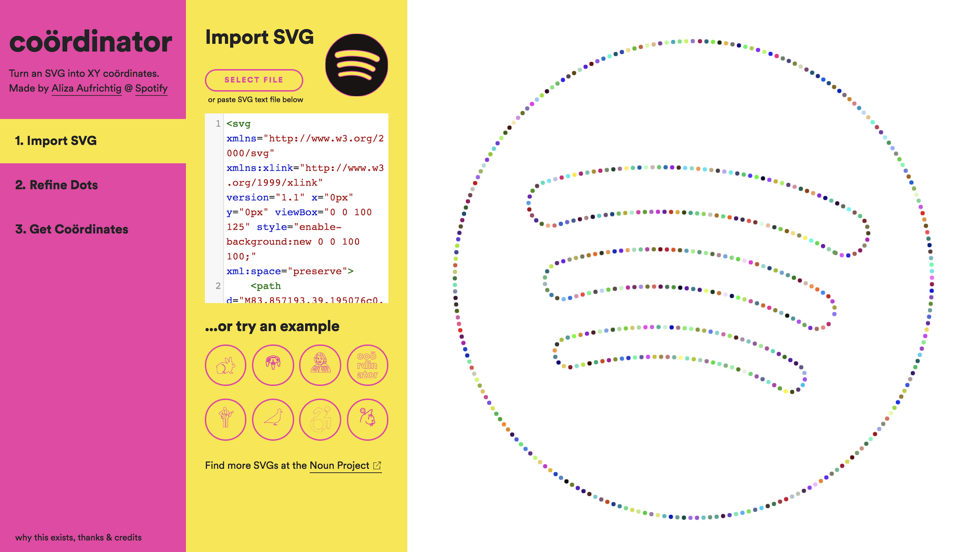
Coördinator is an open source browser interface to help you turn an SVG into XY coordinates. That means you can now take any SVG file, turn it into dots, and use those dots in a data visualization.
Already have some ideas for why this could be supremely useful? Visit our hosted version, or run it locally. Curious about why such a tool exists? Very fair. Read on.
Why might I want to turn an SVG into XY coordinates?
I created Coördinator as a personal side project to inject some whimsy into dot-based data animations. There are many data visualizations that use dots/points/particles to represent constant data points within an animation. As the dots move into different configurations, they continue to represent the same entity. This concept is known as object constancy, and it can help people track a single point of data throughout a visualization animation.
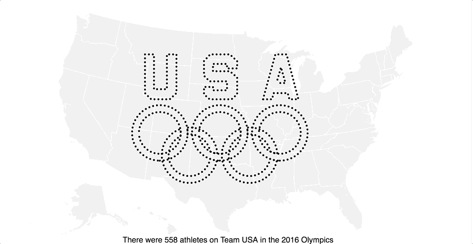
Usually, the places the points move are completely data-driven, like this excellent example that sorts people into groups, shows their location on a map, and places them on a timeline. For kicks, I made this simple example, with real Olympics 2016 data, to show how you could intersperse “coördinated” images within a data-driven piece. Coördinator allowed me to size the Olympic logo properly to work with 558 dots, and the dots that comprise the running man are indeed the 129 people on track and field. It allows you to be playful and purposeful at once.
If you want to play around with dot transitions, you can use this block I created and replace my coordinates with yours.
Okay, cool idea, why did you make this?
Dita Von Teese agreed to talk with Spotify about her listening history at the 2017 Cannes Lions Festival, and she gave permission to Spotify to analyze her listening data ahead of time. I worked with a team of Spotify researchers–the excellent Clay Gibson, Ian Anderson, Alice Wang and Yang Sui–to tell a story with the “Dita Data,” and I was responsible for creating a visualization as a backdrop to a live interview with Von Teese.
Over several years, Von Teese had listened to 7,532 streams on Spotify. The idea was that a single dot would represent each stream, and 7,532 dots would fly around throughout the presentation and congeal into groupings by listening time, genre, album, release year, and many other data attributes. The theme of the presentation was, “You are what you stream,” so I reallllly wanted the streams to ultimately resolve into Von Teese’s face. For her tracks to literally be her.
I had a vision of Dita Von Teese’s beautiful face composed of 7,532 dots, and needed a way to conjure this reverie into actuality. And this is where Coördinator was born.
To make this happen, I traced her headshot in Adobe Illustrator; then I made a quick and dirty web app to convert the SVG of her face into XY coordinates and size it perfectly for the presentation. It was then simple to integrate these coordinates into the existing data-driven animations that I was working on with fellow Spotify developer Dan Delany. You can view the whole presentation here; the Coördinator-driven parts are at the beginning and end.

So the dream of Dita as dots became reality, just in time for the Spotify Cannes Lions panel. And my manager, Edward Lee, kindly encouraged me to build out this Coördinator pet project of mine as a tool for others to use, too. Which brings us here today.
How does it work?
It’s all based on two simple, powerful SVG methods: SVGGeometryElement.getTotalLength() and SVGGeometryElement.getPointAtLength(). The first method gets the length of a path within an SVG. Then, you can divide the length into the number of points you want, and use the second method to get the XY coordinates of the points at those length positions. It’s so simple, and yet…
I was completely unaware of these methods until Noah Veltman–the man who bends SVGs with his mind (the author of the exceptional open source shape interpolation library, Flubber)–responded to my tweet for help. From there, Coördinator emerged, with these two methods at the core.
Okay, so these methods are so simple and I get it. Why use Coördinator?
Coördinator handles multiple paths for you
These two methods work great to convert an SVG with a single path into a list of coordinates. But many SVGs have multiple paths. If you have a fixed number of dots you want in your shape, it requires a bit of math to make sure that your dots are evenly spaced between your different paths. Coördinator does that for you!
Coördinator handles shapes, not just paths
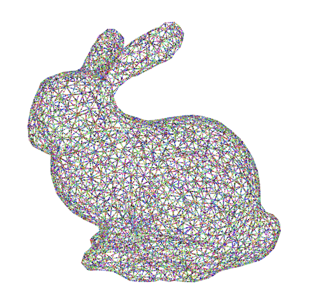
In addition to paths, SVGs can contain shapes, like rectangles or circles. SVG2 is slated to support these length methods on other shapes, but there isn’t currently dependable browser support. Coordinator uses Pathologist, an obscure library by my pal Rich Harris–better known for his not-so-obscure JS libraries–to convert any shapes to paths, and then performs the length operations on them.
For example, I was able to take art that my talented friend Jan Diehm made for me as a wedding gift (which just so happened to be in an SVG that contained hundreds of paths and shapes), and render it with 100,000 evenly spaced dots. Because, well, just because I can.
Did you coördinate any fun shapes? Send them my way!
You can use the visual interface to get the exact image you want
If you have a fixed number of dots that you need within your image, like in the Dita Von Teese case, Coördinator can help you scale the images so that they work with your dot number constraint with an easy-to-adjust slider. And if your images aren’t data driven, and you think the dots just look neat, you can adjust the sliders until you get your image just right. For example, I was able to scale myself just right to be made out of 2018 dots (to celebrate the release year of Coördinator!)

Why is this in the browser and not a library?
I think most of the utility of Coördinator comes from being able to edit the dots in a visual interface and get them to look exactly right. I see it more as a visual preparation step for an ultimately visual final product.
I like dots, but I don’t like data. Can I use Coördinator?
Absolutely. Data aside, it’s fun to play with dot animations and JavaScript, and the tool makes it easy. Haven’t you always wanted to recreate marquees from the golden age of Hollywood, or animate a shivering snowman?


I like dots, but I don’t like programming. Can I use Coördinator?
Yes! In addition to downloading coordinates, you can also download a PNG of your coördinated image. I’ve seen people prepare their pumpkins by poking holes along the lines of the images. This will tell you exactly where to put the pins! So slap this N64 controller on a pumpkin and have the raddest Jack O’Lantern in town.

Okay, I’m ready to fill my life with dots. Where can I find SVGs?
I’ve found The Noun Project to be a great source of SVG images, and included many of their icons as examples in Coördinator. Wikimedia Commons is also a good source. And you can make your own in Adobe Illustrator, amongst other vector-based programs.
It’s open source! How can I contribute?
- It would be great if Coördinator could parse text into path outlines. If anyone has ideas about how to convert text to path in a browser, let me know, or better yet, open a PR. Currently, if you want to use Coördinator to outline a font with dots, you need to go into a tool like Illustrator and create outlines of the text and then export those as paths.
- Exporting GIFs with simple animations, like the shivery snowman, or marquee effect, of your dots, directly from the tool.
- Other ideas for improvements? Made something coöl? Let me know!
Aliza Aufrichtig is a designer and developer at Spotify.
Tags: Data


