Introducing Chartify: Easier chart creation in Python for data scientists
Why we built a new open source Python data visualization library.
Have you ever been frustrated with the complicated experience of making charts in Python? We have, so we created Chartify, an open-source Python library that wraps Bokeh to make it easier for data scientists to create charts.
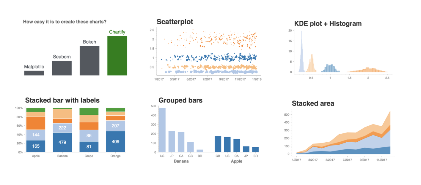
Chartify is more intuitive than other charting tools
Back in 2017, we took a good look how data scientists at Spotify created charts. Unsurprisingly, there were many different tools used, like Seaborn, Matplotlib, Plotly, Bokeh, Ggplot2, D3, and Tableau.
Despite the abundance of all these tools, chart creation was a major pain point in the data science workflow. Data scientists routinely spent 30+ minutes meticulously crafting their visualizations. It wasn’t a straightforward or enjoyable process because data scientists had to spend an excessive amount of time configuring details. For example, suppose you’d like to apply percent formatting to a chart’s axis ticks. This happens often — any time you’re dealing with percent data. Your experience might look like this in Matplotlib:
tick_values = plt.axes().get_yticks()

plt.axes().set_yticklabels([‘{:1.1f}%’.format(value) for value in tick_values])
Axis tick formatting in Matplotlib.
It’s pretty clear why data scientists don’t find the solution intuitive or easy to remember. As a result, our Matplotlib users made regular trips to StackOverflow or Slack to troubleshoot many problems like this that should be easy to solve.
Here’s the same goal accomplished in Chartify:
chart.axes.set_yaxis_tick_format(‘0.0%’)
Axis tick formatting in Chartify
Chartify’s syntax is significantly more concise and user-friendly. We added suggestions in the docstrings so that users can recall the most common formatting options. This lets data scientists spend less time and brainpower on configuring chart aesthetics.
We even made it so that blank charts show users how to modify essential chart labels:
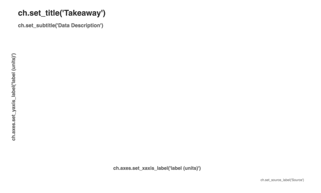
Blank charts include instructions for users
Chartify removes the burden of custom data formatting
Another common pain point with other tools is that different plotting methods expect slightly different input data formats. Tasks such as switching from horizontal to vertical bar charts or switching grouped bar hierarchy require users to completely reformat their input data. Data scientists spent lots of time manipulating data frames into the right state for their charts. Before Chartify, it was common to see requests like this in our Slack channels:
“I’ve been stuck on a matplotlib barplot ordering issue for the past 30m… couldn’t figure out by searching. Can someone help me?”
Chartify’s consistent input data formatting makes it much faster to create and iterate on charts since less time is spent on data munging. We’ll let the example of how bar hierarchy is changed in Chartify speak for itself:

Chartify offers a simple solution for 80% of problems
While creating Chartify we analyzed the common chart types produced by data scientists at Spotify. We found that most problems could be solved by just a few chart types, so we focused our efforts on these use cases. Scroll through the example notebook to see the full list of chart types that Chartify is capable of generating.
In order to simplify the user experience, we’ve attempted to give data scientists control over only the core essentials and integrate with specific use cases. For example, we built it for working in a jupyter notebook or jupyter lab environment and presenting the charts in slides. That’s why we restrict chart sizes: Users don’t have to think in pixels — they can just specify the chart size relative to the space on the slide.
Color is another example of how Chartify simplifies charting. Color palette types are aligned to the different use cases for color:

Examples of Chartify color palette types
Users will need low-level plotting functionality at times, so we’ve attempted to balance simplicity with flexibility. Chartify is a wrapper around Bokeh, so users have the option to fall back on manipulating Chartify charts with Bokeh if they need more control.
We hope you’ll give Chartify a try and that you find it makes your data visualization tasks easier. Please don’t hesitate to reach out if you have suggestions or if you would be interested in contributing to the library!
Getting started
- Follow the installation instructions.
- Browse through the examples notebook.
- Clone the chartify repo and walk through the tutorial notebook for an introduction to the core concepts of Chartify.
Support
Join #chartify on spotify-foss.slack.com
Use the Chartify tag on StackOverflow.
Contributors
Chartify was built through a team effort with contributions from:
- Chris Halpert
- Amar Patel
- Skyler Johnson
- Lynn Root
Tags: Data


