Squad Health Check model – visualizing what to improve
For more recent information on Spotify’s Health Check model, check out this blog post.
What is a squad health check model?
A lot of companies experiment with ways of measuring and visualizing how their teams are doing. They’re usually called “maturity models”, and involve some sort of progression through different levels.
The intent of these types of models is usually benign – for example managers or coaches in larger organizations who want to get a sense of where they should focus their improvement efforts, spot systemic problems, and help teams become more self-aware so they can focus their improvement efforts too.
We prefer to use other terms like “health check model”, because “maturity” sounds a bit… well…. patronizing. Plus, most of our models don’t involve progressing through different levels, and the primary audience is the team itself rather than management.
Organizational improvement work is very much a guessing game (how do you know what needs to be improved, and how will you know if it’s improving?). A systemic approach with clear visualization can reduce some of the guessiness.
OK, but do models like this really work?
It varies. Sometimes a model like this can be really helpful. Sometimes it’s more like “meh” – people dutifully do the workshops or surveys or whatever, and the data is then ignored.
Beware though. At some companies we’ve seen models like this become a monster, a systemic tool of oppression causing suboptimization and fear as managers use the “maturity model” to judge the teams and pit them against each other, and teams hide their problems to look good. Not a pretty picture!
Here’s a radically generalized “chance of success” pie-chart based on what we’ve seen so far at various companies:
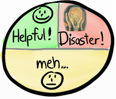
However, although the potential damage is worse than the potential gain, there IS a potential gain, and there are ways to avoid the disaster scenario.
At Spotify we’ve done careful experimentation with this for several years, and found some ways that work fairly OK (as in more gain than pain). At best Helpful, at worst Meh, and so far never a Disaster. We’ve introduced this health check model to several other companies as well and heard similar results, so we figured it’s time to write an article :o)
Who the health check model is for
When checking the health of a squad (our term for a small, cross-functional, self-organizing development team) there’s really two stakeholders:
- The squad itself. While discussing the different health indicators, the squad builds up self-awareness about what’s working and what’s not. The broad selection of questions helps expand their perspective. Perhaps they were well aware of the code quality issues, but hadn’t really thought about the customer value perspective, or how fast they learn. It also provides a balanced perspective, showing the good stuff as well as the pain points.
- People supporting the squad. Managers and coaches that work outside (or partly outside) the squad get a high level summary of what’s working and what’s not. They can also see patterns across multiple squads. If you have dozens of teams and can’t talk to everyone about everything, a visual summary like this helps you figure out how to spend your time, and who to talk to about what.
The first step in solving a problem is to be aware of it. And this type of visualization makes it harder for everyone to ignore the problem.
How we do this at Spotify
We do basically three things:
- Run workshops where members of a squad discuss and assess their current situation based on a number of different perspectives (quality, fun, value, etc).
- Create a graphical summary of the result
- Use the data to help the squads improve
We have several variants, one is simply called the “squad health check model”, others are called things like “fluent@agile game” and “quarterly reflection” (maybe later articles on that). The health check model is an improved version of the old “autonomous squads” quarterly survey mentioned in the 2012 article Scaling Agile @ Spotify.
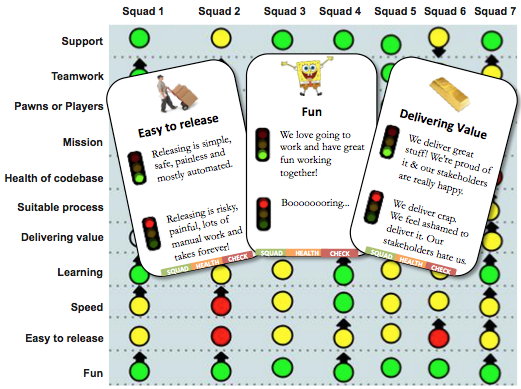
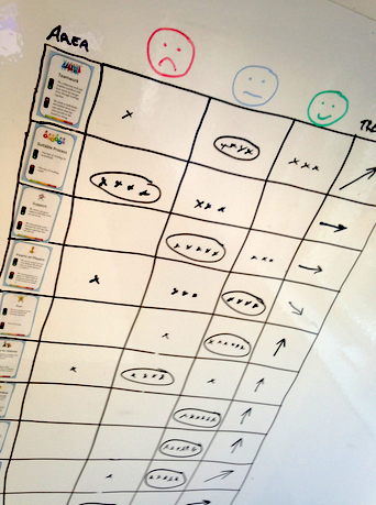
Here’s a real-life example of health check output for one tribe:
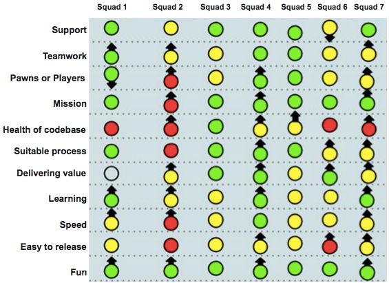
It shows how 7 different squads in a tribe see their own situation. Color is current state (green = good, yellow = some problems, red = really bad). Arrow is the trend (is this generally improving or getting worse?).
Stare at it for a minute, and you start seeing some interesting things:
- Scan each column, and you see some major differences between squads. Squad 4 is happy with just about everything. Squad 2 is having lots of trouble, but most things are improving.
- Scan each row, and you see systemic patterns. Every squad is having fun (and it’s even improving)! Motivation is apparently not a problem at all. But the release process is problematic, and the codebase is overall in bad shape. Over time, that will probably reduce the Fun as well.
- Scan the overall picture, and you see that just about every arrow is up, only two down arrow in the whole picture. That means the improvement process (the most important process of all) seems to be working.
This is, of course, just an approximation of reality (“all models are wrong, but some are useful” – George Box). So it’s worth double checking things before taking action.
Is Squad 4 really in such great shape, or are they just optimistic and not seeing their own problems? Most squads think they are delivering good value to their customers – but how do they know? Is that based on wishful thinking or real customer feedback?
In this particular case, squad 4 was actually formed just a week before the health check and they were definitely in the forming phase, or “on honeymoon”. So both squad 2 and squad 4 needed a lot of support.
“Easy to release” was clearly a major issue, so this led to a bigger focus on things like continuous delivery, and we’ve seen some good progress there.
Note that this is a self-assessment model, all based on the honesty and subjective opinions of the people in the squads. So it only works in a high-trust environment, where people trust their managers and colleagues to act in their best interest. The data is easy to game, so the key is to make sure there is no incentive to do so.
Fortunately Spotify is a pretty high-trust environment and the managers and coaches are very careful to show that this is a support tool, not a judgement tool.
How we gather the data
We’ve found that online surveys suck for this type of thing. Mainly because it cuts out the conversation, and that’s the biggest part of the value. The squad members gain insights while having the discussion, and the coach gains insights on how to effectively help the squads. The data alone gives you only a small part of the story, which could be misleading.
So we (usually agile coaches) organize workshops with the squads, facilitating a face-2-face conversation around the different health indicators. One or two hours is usually enough.
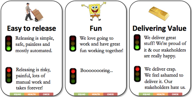
To facilitate this we have a physical deck of “Awesome Cards”, each card is one health indicator with an “Example of Awesome” and “Example of Crappy”.
(Download the cards as PDF or PPTX – thx Martin Österberg for designing the card layout)
The deck typically has around 10 cards, here is an example of a complete deck:
| Area | Example of Awesome | Example of Crappy |
| Easy to release | Releasing is simple, safe, painless & mostly automated. | Releasing is risky, painful, lots of manual work, and takes forever. |
| Suitable process | Our way of working fits us perfectly | Our way of working sucks |
| Tech quality (code base health) | We’re proud of the quality of our code! It is clean, easy to read, and has great test coverage. | Our code is a pile of dung, and technical debt is raging out of control |
| Value | We deliver great stuff! We’re proud of it and our stakeholders are really happy. | We deliver crap. We feel ashamed to deliver it. Our stakeholders hate us. |
| Speed | We get stuff done really quickly.No waiting, no delays. | We never seem to get done with anything.We keep getting stuck or interrupted. Stories keep getting stuck on dependencies |
| Mission | We know exactly why we are here, and we are really excited about it | We have no idea why we are here, there is no high level picture or focus. Our so-called mission is completely unclear and uninspiring. |
| Fun | We love going to work, and have great fun working together | Boooooooring. |
| Learning | We’re learning lots of interesting stuff all the time! | We never have time to learn anything |
| Support | We always get great support & help when we ask for it! | We keep getting stuck because we can’t get the support & help that we ask for. |
| Pawns or players | We are in control of our destiny! We decide what to build and how to build it. | We are just pawns in a game of chess, with no influence over what we build or how we build it |
For each question, the squad is asked to discuss if they are closer to “awesome” or closer to “crappy”, and we use basic workshop techniques (dot voting, etc) to help them reach consensus about which color to choose for that indicator, and what the trend is (stable, improving, or getting worse).
We like keeping it at three levels (green/yellow/red) to keep it simple. The exact definition of the colors will vary, but something like this:
- Green doesn’t necessarily mean things are perfect. It just means the squad is happy with this, and see no major need for improvement right now.
- Yellow means there are some important problems that need addressing, but it’s not a disaster.
- Red means this really sucks and needs to be improved.
Yes, this is subjective data. In theory the squad may choose to involve hard data (cycle time, defect count, velocity, etc), but few do so. Because, even with hard data, the squad needs to interpret the data and decide if it means we have a problem or not. So at the end of the day, everything is subjective anyway. If something feels like a problem, that in itself is a problem.
Sometimes we combine this with retrospectives, for example vote on one card and decide on actions to improve that area.
Which questions to ask?
If you look at the various examples above, you’ll see that the actual questions vary a little.
Guiding principles:
- The questions are designed to cover a wide range of different perspectives.
- These questions are just a starting point, a default selection. Squads are free to remove, add, or change the questions to whatever they think is relevant.
- Try to limit to 10 questions or so. If we have more questions than that, some are probably too overlapping and can be removed.
We make sure the questions are about the environment in which the squad operates, and not about hard output (such as velocity). That makes the survey less threatening, and reinforces the notion that the survey is about support and improvement, not judgement.
Our assumption (true or not) is that a squad intrinsically wants to succeed, and will perform as well as it can under given circumstances.
How often do we measure squad health?
As mentioned, we have a number of different models in play so it varies a lot. We haven’t really converged on any specific “perfect time-interval” for these things (and probably never will).
Quarterly seems to be a good starting point though. Every month seems too often (people get fed up with it, and the data doesn’t change fast enough to warrant it). Bi-annually seems too seldom (too much happens within that period). But, again, it varies.
Wrapup – things to keep in mind if you are going to do this
A model like this CAN help boost and focus your improvement efforts. But it can also totally screw up your culture if used inappropriately! So tread with care.
Here are some guidelines to improve your likelihood of success:
- Be clear about your motives for introducing the model. It should about improvement, not judgement.
- Gather data primarily through Face-to-face communication, not online surveys. The data gathering process needs to be interesting and fun.
- Involve teams in how the model is applied, and let them modify it as they see fit.
- Team acceptance matters more than data consistency. If team A chooses a slightly different set of questions than team B, that’s fine (even though the summary picture will be a bit messier).
- Make sure there is no incentive to game the model. There should be no reason for a team to want to “look good”.
- Find a simple way of visualizing the data. The more obvious and intuitive the visualization is, the more likely it will be used.
- Beware of comparing teams. If team A is mostly green and team B is mostly red, that doesn’t mean team A is “better”. It could just as well mean that team A has a simpler context or a more optimistic outlook, or that team B is more honest about their struggles. Either way, it’s likely that team B needs some support. The manager’s attitude should be “how can I help?” and not “why are you guys worse than the others?”.
- Follow up. Ask people questions like “Is this model helping you?”, “If we stopped doing health checks, would you miss them?”, “How could we make this model more useful?”. The model itself (and your way of applying it) needs to continuously improve.
See also Martin Fowler’s article about maturity models, very insightful.
OK, that’s it. Hope this article was useful! Have you also been experimenting with this kind of stuff? Please share your experiences (positive or negative) in the blog comments!
– Henrik Kniberg & Kristian Lindwall, Sep 2014.
(Download the cards & instructions as PDF or PPTX)
(Translations of this article: Chinese, French)
Tags: agile, health check


